How to import?
Select the “Paste (All)” option from the Structure panel, or another method involves clicking on an empty area within the Structure panel, pressing the “Esc” key followed by the “Ctrl/Cmd + V” key combination.
Structure & Styling
1. Building and styling the full screen menu
Building the basic NAV structure.
Start by adding a DIV > CONTAINER > DIV + DIV
Give the first DIV a class of .fs-menu_wrapper
Give the CONTAINER a class of .fs-menu_container
Giver the third DIV a class of .fs-menu_nav
Giver the fourth DIV a class of .fs-menu_image-wrapper
You HTML structure schould look like this:

Styling the .fs-menu_wrapper:
display: flex
flex-direction: row
align-self: center
justify-content: center
align-items: center
padding-left: 2rem
padding-right: 2rem
width: 100%
height: 100%
position: fixed
top: 0
left: 0
overflow: hidden
background-color: #000
Custom CSS:
root {
opacity: 1;
}
Styling the .fs-menu_container:
display: flex
flex-direction: row
justify-content: space-between
position: relative
Styling the .fs-menu_nav:
display: flex
flex-direction: column
align-self: top
justify-content: top
align-items: start
row-gap: 1rem
width: 100%
position: relative
z-index: 2
Styling the .fs-menu_image-wrapper:
width: 50%
height: 120%
position: absolute
top: 0
right: 0
z-index: 1
overflow: hidden
Inside of the .fs-menu_nav:
We are now building the Menu LINKS.
We have 4 LINKS in the demo. You can duplicate the .fs-menu_item for every Menu LINK after its build.
We will start with the Menu LINK for Projects.
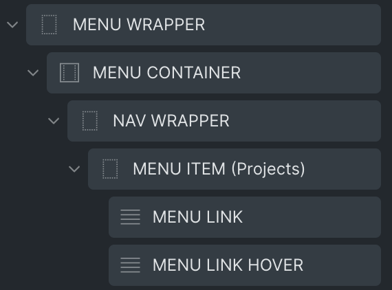
Add a DIV > TEXT + TEXT
Give the DIV a class of .fs-menu_item and .is-projects ->
NOTE: You can rename the class .is-projects to everything that fits for you. There will be no styling for .is-projects class, as we just need it for the right targeting when it comes to animating it later.
Give the first TEXT a class of .fs-menu_link
Give the second TEXT a class of .fs-menu_link–hover
HTML structure should look like this now:

Styling the .fs-menu_item:
HTML Tag: a (link)
Set you desired target under Link
position: relative
overflow: hidden
pointer: cursor
Styling the .fs-menu_link:
Insert TEXT of you choice. In the demo I am using “Projects”.
The styling is up to you, in the demo I am using:
color: #000
text-transform: uppercase
font-size: 14rem -> 8rem on tablet & mobile landscape, 6rem on mobile potrait
font-family: ‘Helvetice Neue’
font-weight: 700
line-height: 1
Styling the .fs-menu_link–hover:
Insert the same TEXT as in the .fs-menu_link.
Apply the same styling as in the .fs-menu_link, but set a different color:
color: #000
You can now duplicate the .fs-menu_item. Delete the .is-projects class from the duplicates and add classes that fit for you. In the demo I am using:
.is-about
.is-news
.is-contact
You do yourself a favor if you name the HTML elements in the Bricks structure panel.
Full HTML structure should look like this now:

Inside of the .fs-menu_image-wrapper:
We are now building the Menu IMAGES.
We have 4 IMAGES in the demo. You can duplicate the .fs-menu_item for every Menu IMAGE after its build.
We will start with the Menu IMAGE for Projects.
Add a DIV > IMAGE.
Give the DIV a class of .fs-menu_image-holder and a class of .is-projects
NOTE: You can rename the class .is-projects to everything that fits for you. There will be no styling for .is-projects class, as we just need it for the right targeting when it comes to animating it later.
Give the IMAGE a class of .fs-menu_image
HTML structure should look like this:

Styling the .fs-menu_image-wrapper:
width: 50%
height: 120%
position: absolute
top: 0
right 0
z-index: 1
overflow: hidden
Styling the .fs-menu_image-holder:
width: 100%
height: 100%
position: absolute
top: 0
left: 0
Styling the .fs-menu_image:
Add an IMAGE of your choice
object-fit: cover
width: 100%
height: 100%
You can now duplicate the .fs-menu_image-holder. Delete the .is-projects class from the duplicates and add classes that fit for you. In the demo I am using:
.is-about
.is-news
.is-contact
That’s it for the NAV structure and styling.
Change the display property in the .fs-menu_wrapper class to display: none, so its not overlaying the rest of the page in the builder. You will switch to display: flex again, when you are finished.
HTML structure should look like this:

2. Building and styling the Hero Section and Menu Trigger
We will start with the Hero Section:
Add a SECTION > CONTAINER > HEADING
Give the SECTION a class of .fs-section
Give the CONTAINER a class of .fs-container
Giver the HEADING a class of .fs-heading
Styling the .fs-section:
display: flex
align center on all axis
height: 100vh
Styling the .fs-container:
display: flex
align center on all axis
Styling the .fs-heading:
fill in text of you choice
HTML Tag: H1
font-family: ‘Helvetica Neue’
font-weight: 300
Building the Menu Trigger:
Add a BUTTON and give it a class of .fs-menu_trigger
HTML Tag: button
text: none
style: none
set an icon of your choice in my case I am using the “X” icon from the Themify library
gap: 0
padding: 0
width: 80px
height: 80px
min-width: 80px
min-height: 80px
position: absolute
top: 50px
right: 100px
z-index: 999
display: flex
flex-direction: column
align center on all axis
background-color: #c2ff2e
border-radius: 50%
HTML Structure should look like this now:

Great! Everything HTML and CSS wise is set up. Now we can jump into the fun part.
GSAP with Bricksforge
We will build the animations in 4 steps:
- Setting up an Event
- Menu reveal animation
- Nav Link animation
- Nav Link Image animation
You can set the opacity of .fs-menu_wrapper to 1, so you can see what you build.
1. Setting up an EVENT on Pageload
Open the Bricksforge Panel -> EVENTS -> create a new EVENT. Give the EVENT a descriptive name e.g. [FS] SET – Links & Wrapper.
Event: On Pageload (DOMContentLoaded)
Add an ACTION in the ACTIONS TAB -> GSAP Set
In the ACTIONS SETTINGS TAB:
Target Element: Custom (Document QuerySelector)
Input: .fs-menu_link .fs-menu_link–hover
JavaScript Object: {transformPerspective: 400}
Add another ACTION in the same EVENT. Again GSAP Set.
In the ACTIONS SETTINGS TAB:
Target Element: Custom (Document QuerySelector)
Input: .fs-menu_wrapper
JavaScript Object: {autoAlpha: 0, scaleX: 0.001, scaleY: 0, borderRadius: 150}

2. Menu reveal animation
Go to TIMELINES add a new TIMELINE and give it a descriptive name e.g. [FS] Menu reveal
In the SETTINGS TAB:
Trigger: Click
Trigger Selector: .fs-menu_trigger
With secondary click: ON
The TIMELINE consists of 6 different ANIMATIONS.
In the ANIMATIONS TAB add a new ANIMATION:
Fade the HEADING out when .fs-menu_trigger is clicked.
Selector to animate: .fs-heading
Method: to
TranslateY: 10%
Opacity: 0
Duration: 0.3s
Delay: 0
Ease: power3.out
Add another ANIMATION:
Set the autoAlpha to 1, so the opacity is 1 and visibility is set to visible
autoAlpha is great, because it automatically sets opacity and visibility.
Selector to animate: .fs-menu_wrapper
Method: to
Animation Object: {autoAlpha: 1}
Duration: 0.3s
Delay: 0
Ease: power3.out
Add another ANIMATION:
Setting the scale on the Y axis to 1, so we get the thin vertical line.
Selector to animate: .fs-menu_wrapper
Method: to
Scale X Axis: 0.001
Scale Y Axis: 1
Duration: 0.4s
Delay: 0
Ease: power3.out
Add another ANIMATION:
Setting the scale on X axis to 1, so the Menu spans the whole width + we set the border-radius to 0.
Selector to animate: .fs-menu_wrapper
Method: to
Animation Object: {borderRadius: 0}
Scale X Axis: 1
Scale Y Axis: 1
Duration: 0.4s
Delay: 0
Ease: power3.out
Add another ANIMATION:
Letting the LINKS fade in.
Selector to animate: .fs-menu_link
Method: from
Opacity: 0
Blur: 25
Duration: 0.5s
Delay: 0
Ease: power2.out
Use Stagger: ON
Stagger: 0.08
Add another ANIMATION:
Turning the MENU trigger 45deg on the Z axis so it turns to a cross.
Selector to animate: .fs-menu_trigger
Method: from
Rotate Z axis: 45deg
Duration: 0.2s
Delay: 0
Ease: power3.out
OK. Menu reveal animation is done.
2. Nav Link animation
Go to TIMELINES add a new TIMELINE and give it a descriptive name e.g. [FS] Nav Item – Hover
In the SETTINGS TAB:
Match Media Rule: (min-width: 786px)
Trigger: Hover
Trigger Selector: .fs-menu_item
Handle triggers separately: ON
Reverse on mouse leave: ON
The TIMELINE consists of 2 different ANIMATIONS.
In the ANIMATIONS TAB add a new ANIMATION:
Rattle the .fs-menu_link–hover in on hover.
Child Selector: .fs-menu_link–hover
Method: From to
In the FROM TAB:
Animation Object: {transformPerspective: 400}
Translate Y axis: 90%
Rotate X axis: -140deg
Duration: 0.5s
Delay: 0
Ease: power2.out
Use SplitText: ON
Type: Chars
Use Stagger: ON
Stagger: 0.05
In the TO TAB:
Animation Object: {transformPerspective: 400}
Translate Y axis: 0%
Rotate X axis: 0deg
Duration: 0.5s
Delay: 0
Ease: power2.out
Use SplitText: ON
Type: Chars
Use Stagger: ON
Stagger: 0.05
Add another ANIMATION:
Rattle the .fs-menu_link out on hover.
Child Selector: .fs-menu_link
Method: From to
In the FROM TAB:
Animation Object: {transformPerspective: 400}
Duration: 0.5s
Delay: 0
Ease: power2.out
Use SplitText: ON
Type: Chars
Use Stagger: ON
Stagger: 0.05
In the TO TAB:
Animation Object: {transformPerspective: 400}
Translate Y axis: -100%
Rotate X axis: 140deg
Duration: 0.5s
Delay: 0
Ease: power2.out
Position: Custom
Input: 0.05
Use SplitText: ON
Type: Chars
Use Stagger: ON
Stagger: 0.05
2. Nav Image animation
We will create 4 TIMELINES for each IMAGE.
Go to TIMELINES add a new TIMELINE and give it a descriptive name e.g. [FS] Nav Item – Image (Projects)
In the SETTINGS TAB:
Match Media Rule: (min-width: 786px)
Trigger: Hover
Trigger Selector: .fs-menu_item.is-projects
Reverse on mouse leave: ON
In the ANIMATIONS TAB add a new ANIMATION:
Selector to animate: .fs-menu_image-holder.is-projects
Method: From to
In the FROM TAB:
Animation Object: {transformPerspective: 800}
Translate X axis: 50%
Rotate X axis: -45deg
Opacity: 0
Duration: 0.5s
Delay: 0
Ease: power1.inOut
In the TO TAB:
Animation Object: {transformPerspective: 800}
Translate Y axis: 0%
Rotate X axis: 0deg
Opacity: 1
Duration: 0.5s
Delay: 0
Ease: power1.inOut
You can duplicate the TIMELINE and set the correct TRIGGER and SELECTOR TO ANIMATE. The TRIGGER and the SELECTOR TO ANIMATE have to match the CSS classes you added to your .fs-menu_item and .fs-menu_image-holder classes. In the demo I used:
.is-projects
.is-about
.is-news
.is-contact
DONE!


